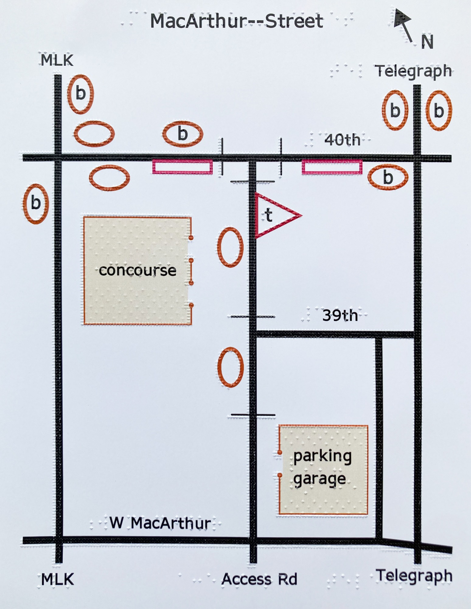
Working with images isn’t in the job description for most access technologists like me, but I believe it should be. I dream of a day when checking out a street map, perusing tattoo designs, or making a seating chart are just as convenient and commonplace for blind folks as for our sighted counterparts.
When we talk about graphics and images, the assumption that they will be experienced visually is implicit in the language we use. We refer to the visual arts, visual aids, and data visualizations; we conflate the world of images with the sense of vision as a means of perception. Our predominantly sighted culture centers and disseminates spatial representations that are meant for, and rely upon, vision as a pathway to understanding.
If you think about blind people’s access to content, it’s likely that a few things come to mind: the development and evolution of braille, the availability of text-to-speech and braille output for onscreen content, and the need for accessible websites and apps that conform to guidelines for screen-reading software. While these technologies form a bedrock of access crucial to information literacy for blind and low-vision people, they primarily address one specific type of information: text.
In an era when lectures, business presentations, news, and entertainment are almost always delivered with rich, often interactive visuals, those of us who are blind usually find ourselves relegated to a text-only experience. Although alt text—the description of images online—allows content authors to describe important visuals, the adage that “a picture is worth a thousand words” falls flat when only words are available. It’s important to experience a stock chart, a circuit diagram, or a map as intended—that is to say, as an image. Textual descriptions of items like these, if they contain all the information in the original image, are painfully verbose and frequently fail to deliver pertinent insights with the precision of an image.
The power of images to convey information precisely and concisely through spatial representation, however, isn’t inherently visual at all. For blind readers, learners, and creators, tactile graphics—images rendered legible by touch—open up the world of spatial communication.
Tactile graphics
As a blind tech educator, it’s my job—and my passion—to introduce blind and low-vision library patrons to tools that help them move through daily life with autonomy and ease. Our team of blind and sighted staff and volunteers runs group workshops and individual appointments that aim to give everyone the confidence to print existing graphics or make their own.

THE DIMENSIONS LAB
In 2016, a blind patron new to New York City called me up with a simple request: he wanted a map of the five boroughs, showing their shapes, relative locations, and sizes. I answered this inquiry with some leads to braille textbook publishers who make maps, but I soon started to wonder: What should blind people do when they want a tactile graphic that doesn’t yet exist? Why had I seen more tactile graphics as a child, in textbooks, than at any other time since? What would need to happen to create a straightforward path, navigable by any blind or low-vision person, between feeling curious about a given image and having a tactile version of the image in hand?
Tactile graphic design is an art of transformation: what appeals to the eye may be cluttered and chaotic to the fingertips. The legibility and impact of a tactile graphic depend on the author’s grasp of practices for conveying information by touch. Since perceivable tactile resolution is much lower than resolution perceivable by vision, it’s imperative that tactile graphics be scaled up enough to make key elements detectable. Since color isn’t within the scope of tactile design, other methods must be used to draw distinctions. For example, a tactile pie chart might use four different textures (untextured “white” space, dotted infill, squares, and stripes) to differentiate four wedges. The classic “flatten the curve” graphic, which used colored lines to convey dramatically different public health outcomes for covid-19 with and without protective measures, is just as effective as a tactile graphic when dotted, dashed, and solid lines are employed to communicate the message.
